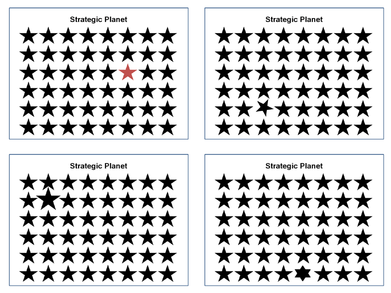
Have you ever wondered how to visually optimise your website? The Gestalt theories of visual perception can help you: there are also online tools available to support the process. This blog will look at one of them and explain the principles behind Gestalt. It is also worth highlighting that this tool can also be used to test printed adverts.
The tool in question is called Feng-GUI (www.feng-gui.com) :
Feng-GUI, a pioneer in measuring visual effectiveness offer designers, advertisers and creatives, a pre-testing and copy-testing tool that predicts performance of an image and video, by analyzing levels of attention, brand effectiveness and placement. Feng-GUI simulates human vision and creates heatmaps based on an algorithm that predicts what a real human would be most likely to look at.
(Source: their website)
Here is an example of how it works: I have taken 2 NHS posters (source http://www.geniumcreative.com/our-work/display/nhs)
They were designed to encourage individuals to identify and feedback money saving ideas. The primary difference is the background colour. Now, which one do you think is more visually optimised? Let’s run it through the Feng-GUI analyser and see what we get.
The Opacity Report.
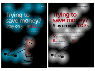
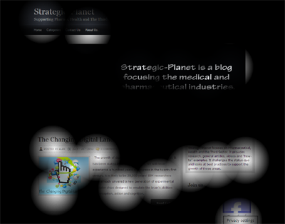
You would use the opacity report to identify which areas are being perceived and which are being ignored. It tones down the information that is not attractive and visually displays what viewers may perceive during the first few seconds of visual inspection: the more transparent areas are those that receive the most attention.
The Heat Map Report.
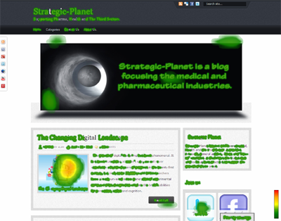
The heat map will display the most attractive elements of the image in the form of “hot” and “cold” spots. It is a predicted eye tracking report that shows what areas of the image will attract the most attention.
The Gaze Plot Report.
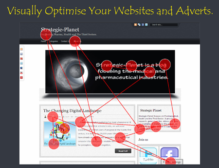
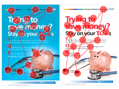
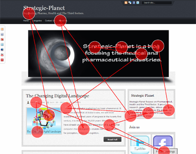
The gaze plot report will visually demonstrate the fixations order and gaze paths. Feng-GUI also refer to it as the scan path report. It is made of a series of short stops (called fixations) and fast movements of an eye (called saccades). Some of you may argue that paths illustrated above are not the same as what you thought you had focused on: just remember it is the visualisation that takes place in the first few seconds.
The AOIs (Areas of Interest) Report.
The Areas of Interest report (AOIs) lets you define areas inside the image and determine the percentage of the attention this area is drawing. These percentages are based on the heat map results for the given area.
In all cases the white background image comes out on top. What was your initial perception? If we go back and review the results we can see that the white background image can be made better by reducing the size of the pig and increasing the font size of the text. Let me now demonstrate how it works with a website design. I have taken my own website and put it through the tool. Here you can see the results:
Overall I am happy with the results but should look at increasing the size of the social links in header and on the left of the screen
The Theory Behind It.
Feng-Gui have spent a lot of time researching the topic and there is a lot of data out there to support the process. Rather than going through many of these detail studies let’s look at Gestalt Theory of Visual Perception: this is where it all began. There are 6 principles that drive this theory:
The principle of proximity.
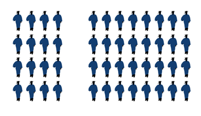
This principle states that “things that are closer together will be seen as belonging together”. A good example to use is words:
Fundamentalist or Fund a mentalist
The two gaps change the word into a statement.
What about imagery: do you see 1 group of graduates or 2 groups?
The principle of similarity.
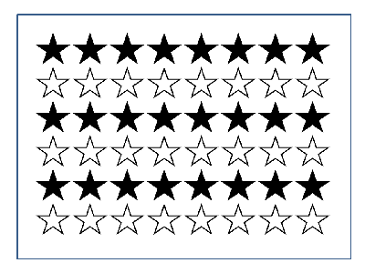
This principle states that individuals will tend to see groups that are made up of the same characteristics.
In this example most people will see 3 groups of black stars and 3 groups of white stars.
The principle also states that individuals will group together things that share the same colour, orientation and size. Look at this Gif, can you see the changes in each scene?
The Principle of Common Fate.
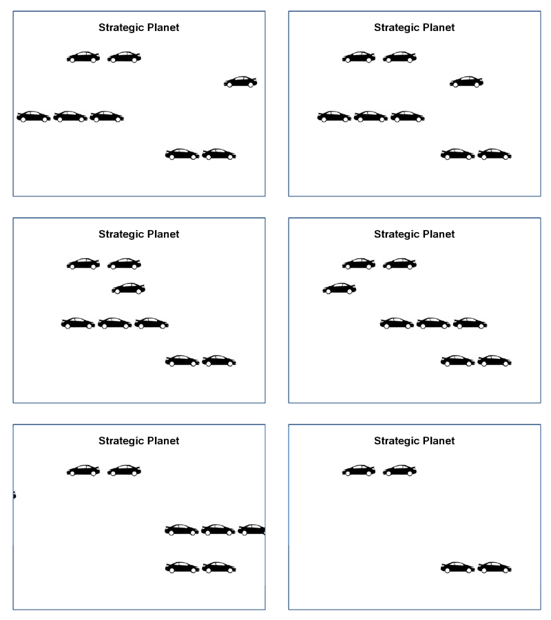
This principle states that objects that move in the same direction are more likely to be related than objects which are stationary or moving in a different direction. Here is an example to illustrate the principle.
The Principle of Good Continuation.
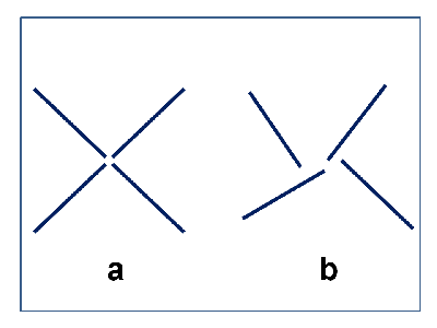
This principle states that objects arranged on a line or curve are more likely to be related than those not on the line or curve. This can be demonstrated by the images below.
The next example demonstrates how the line links the pictures to the words, thus creating conversation between them. Imagine how difficult it would be if comic did not have speech bubbles linked to their characters.
The Principle of Closure.
This principle states that individuals will attempt to close figures in their own mind: here we most people will see a white triangle and not the 3 hexagons with a segment missing in each.
The Principle of Area.
This principle states that most individuals will see the larger image as the background and the smaller as the foreground. In the first diagram we see that the black images are the smaller, they become the foreground, and hence most people will see two heads. In the second diagram, the black images are much larger. This makes the white vase the foreground and for most people the prominent image.
Concluding thoughts.
So there you have it, a very quick insight into why changes to image’s colour, shape, size orientation and movement can drastically affect an individual’s perception of an image. This is why it is critical to optimise your print adverts, banners and websites. It also reduces the frustrating debates that we have to go through when somebody else does not like the colours, style and /or images you have chosen: you can very quickly show them the reports and say “it has been highly optimised to achieve the maximum success.
Alan Shaw
Latest posts by Alan Shaw (see all)
- What is social listening and why it is an important tool for researchers? - July 31, 2021
- COVID-19 and Remote Learning: Experiences of parents supporting children with SEND during the pandemic. - June 30, 2021
- Using Netnography To Evaluate The Launch And Collapse Of The European Super League - April 21, 2021
- Developing Semi-Structured Interview Questions: An Inductive Approach. - April 9, 2020
- Developing Semi-Structured Interview Questions: A Deductive Approach - April 9, 2020
